You just finished building a beautiful website. It looks perfect on your 1440px MacBook display. Then a colleague pulls it up on their Galaxy S23 and the hero image is cut in half, the nav overlaps the logo, and the call-to-action button is unreachable below the fold. Sound familiar?
The naive solution — buy one of every phone — would cost you upward of $10,000 and require an entire shelf to store them. The smart solution is a layered testing workflow using free tools that covers 95% of real-world device scenarios. This guide walks you through every layer of that workflow, from your browser's built-in DevTools all the way to the fastest real-device check you can perform in under 30 seconds.
Why Physical Devices Alone Aren't Enough
Before we dive into the tools, it's worth understanding what you actually need to test and why physical hardware solves only part of the problem.
A responsive design can fail in three distinct ways:
- Layout failure — elements overlap, overflow, or collapse at certain viewport widths
- Visual failure — fonts render differently, images look blurry on high-DPI screens, or colors shift on OLED displays
- Interaction failure — tap targets are too small, hover states don't translate to touch, or form inputs are obscured by the software keyboard
Physical devices excel at catching visual and interaction failures but are painfully slow for iterating on layout bugs. Tools excel at layout and speed. The winning strategy combines both — tools first, devices last.
The Pareto principle applies here: 80% of responsive bugs can be caught with browser DevTools and a good online simulator. Save real device testing for the final pre-launch QA pass and for catching rendering subtleties.
Layer 1 — Your Browser's Built-In DevTools
Every modern browser ships with a device emulation mode. It's free, it's instant, and it's the first line of defense for any responsive developer. Here's how to squeeze the most out of each one.
Chrome DevTools Device Mode
Open Chrome DevTools (F12 or Cmd+Opt+I), then click the device toolbar icon (or press Ctrl+Shift+M). You're now in Device Mode. Key features to know:
- Responsive preset — drag the viewport handles to test any arbitrary width, watching your CSS breakpoints trigger in real time
- Device list — choose from iPhone 14 Pro, Galaxy S20 Ultra, Pixel 7, iPad Mini, and many more
- DPR simulation — test how your site looks at 1×, 2× (Retina), and 3× (high-DPI Android) pixel density
- Network throttling — combine device emulation with a "Fast 3G" profile to test real-world loading on mobile connections
Firefox Responsive Design Mode
Press Ctrl+Shift+M in Firefox. Firefox's version is particularly good for testing touch event simulation and gives you a clean ruler overlay showing exact viewport dimensions. Its screenshot tool also captures the entire page at the simulated resolution, useful for quick visual diffs.
Safari + Xcode iPhone Simulator
If you're on macOS and have Xcode installed, Safari's Develop menu unlocks a full iPhone Simulator. This is the only way to test Mobile Safari's exact rendering engine without a physical iOS device — including WebKit quirks that Chrome DevTools won't surface because Chrome uses Blink internally.
Chrome DevTools device emulation uses your desktop's GPU, font renderer, and browser engine. It accurately simulates viewport dimensions and pixel ratios, but it cannot replicate iOS's Safari WebKit engine or Android's Chrome Blink differences at the rendering level.
Layer 2 — Online Device Simulators
Browser DevTools are powerful but limited to the browser you're running. Online simulators give you a broader view — multiple devices simultaneously, saved URLs, shareable previews, and QR code generation for jumping straight to real-device testing.
When choosing an online simulator, look for these capabilities:
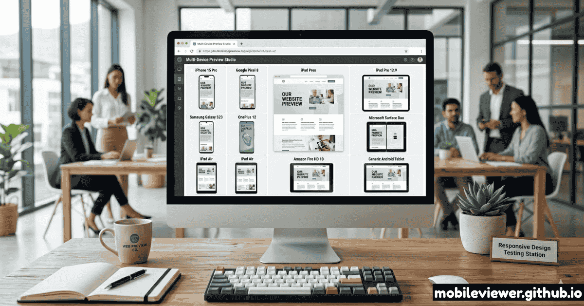
Multi-Device Preview Grid
See your site on mobile, tablet, and desktop side by side. Spot layout inconsistencies without switching tabs.
EssentialAccurate Viewport Dimensions
The simulator must use actual CSS viewport dimensions, not just scale the page. 390×844 for iPhone 15, not a shrunk desktop view.
EssentialQR Code Generation
One-click QR lets you jump from the browser simulator to a real phone scan in seconds — the fastest real-device handoff.
Time-saverCustom Viewport Entry
Enter any width/height for edge case testing — unusual wearable screens, old budget Androids, or ultra-wide monitors.
Power featureLayer 3 — A Systematic Breakpoint Strategy
Testing random widths wastes time. Testing the right widths catches real bugs. Here's the set of breakpoints that covers the widest range of real-world traffic while remaining manageable:
| Viewport Width | Target Devices | Priority |
|---|---|---|
360px |
Budget Android phones, older Samsung | High |
375px |
iPhone SE (3rd gen), older iPhones | High |
390px |
iPhone 14, iPhone 15 | High |
430px |
iPhone 15 Plus, iPhone 15 Pro Max | High |
768px |
iPad portrait, small tablets | High |
1024px |
iPad landscape, 11" laptops, small desktops | Medium |
1280px |
Standard laptop screens | Medium |
1440px |
Common desktop monitor | Medium |
1920px |
1080p full HD desktop | Low |
Check your site's Google Analytics audience report under Audience → Mobile → Devices to see exactly which screen resolutions your real users have. Prioritize your testing around the top five.
Layer 4 — The Right Testing Order
Testing in the wrong order means you'll find a critical bug at the end of your workflow and have to restart. Test in this sequence to catch problems as early as possible:
Test in Chrome DevTools first
Use the responsive drag handle to sweep from 360px all the way to 1920px. Watch for elements that break at any intermediate width — not just your declared breakpoints. Resize slowly so nothing slips through.
Load specific device presets in an online simulator
Use Mobile Viewer to check the exact viewport and pixel ratio of your top traffic devices. This verifies your layout at precisely the dimensions real users see — not approximations.
Run the multi-device grid view
Mobile Viewer's multi-device preview renders mobile, tablet, and desktop in one panel. This is the fastest way to spot layout regressions introduced by a CSS change that looks fine on one size but breaks another.
Scan to a real device with QR code
Generate a QR code from Mobile Viewer and scan it with an actual iPhone or Android. This is your sanity check for touch target size, font rendering, and system browser quirks. Aim to do this on at least one iOS and one Android device before any launch.
Run a Lighthouse / Page Speed check
Open Chrome DevTools → Lighthouse → select "Mobile" → run the audit. A poor mobile performance score directly correlates to higher bounce rates and lower Google rankings. Fix any score below 75.
The 8 Most Common Responsive Bugs (and How to Spot Them Fast)
Knowing what to look for cuts your testing time in half. These are the bugs that appear most frequently and are most often missed:
- Horizontal scroll caused by fixed-width elements — set
overflow-x: hiddenonbodytemporarily to reveal which element is causing it, then fix the root cause - Text too small to read without zooming — minimum body font size for mobile is 16px; anything smaller forces users to pinch-zoom
- Touch targets under 44×44px — Apple's HIG and Google's Material Design both specify 44px minimum; buttons in nav menus are the most common offender
- Content overflow on 360px screens — budget Androids are still a significant slice of global traffic; test at 360px even if it feels narrow
- Images not using
max-width: 100%— any image with a fixed pixel width will break out of its container on small screens - Viewport meta tag missing or misconfigured — without
<meta name="viewport" content="width=device-width, initial-scale=1.0">, mobile browsers will render your site at 980px and shrink it - Hover-only interactions with no touch equivalent — dropdown menus that only open on
:hoverare completely inaccessible on touch screens - iOS input zoom on focus — inputs with
font-sizesmaller than 16px trigger automatic zoom-in on iOS Safari; set all inputs to at leastfont-size: 16px
Tool Comparison: What Each Method Catches
| Testing Method | Layout Bugs | Font Rendering | Touch Interactions | Browser-Specific Bugs | Speed |
|---|---|---|---|---|---|
| Chrome DevTools | Excellent | Partial | Simulated | No | Instant |
| Mobile Viewer Online Simulator | Excellent | Partial | No | No | Instant |
| Safari + Xcode Simulator | Excellent | Good | Good | iOS/Safari only | 1–2 min setup |
| Real iPhone (via QR code) | Excellent | Perfect | Perfect | Yes | 30 sec setup |
| Real Android (via QR code) | Excellent | Perfect | Perfect | Yes | 30 sec setup |
| BrowserStack / LambdaTest | Excellent | Good | Good | Yes | Slow, costly |
Free Tools Roundup for Every Budget
Mobile Viewer
All-in-one responsive checker with 20+ device presets, QR code generator, multi-device grid, and breakpoint tester.
FreeChrome DevTools
Built into Chrome. Best for rapid iteration during development. Essential for every frontend developer.
FreeFirefox Developer Edition
Excellent responsive mode with touch simulation. Useful for cross-browser comparison with Chrome.
FreeXcode iPhone Simulator
The only way to test real Mobile Safari rendering without a physical iPhone. Requires macOS + Xcode.
Free (macOS only)Android Emulator
Part of Android Studio. Run Android Chrome at exact device specs. Heavy download but extremely accurate.
FreePageSpeed Insights
Google's free mobile performance auditor. Flags Core Web Vitals issues that hurt rankings and UX.
FreeGoing Further: Automated Responsive Testing
Manual testing works well for small sites and active development. For teams or projects with continuous deployment, consider integrating automated visual regression testing:
- Playwright / Puppeteer — run headless Chromium at specific viewport sizes and compare screenshots between commits using visual diff tools like Pixelmatch
- Percy (BrowserStack) — takes snapshot screenshots on every pull request and highlights pixel differences; integrates with GitHub Actions
- Chromatic — purpose-built for Storybook component testing across viewports; excellent for design systems
- Lighthouse CI — automates Lighthouse audits in your CI pipeline and fails the build if the mobile performance score drops below your threshold
For most solo developers and small teams, manual testing with the layered approach above combined with a weekly Lighthouse check is more than sufficient.
Quick Reference Checklist
Bookmark this checklist for every release:
- ☐ Tested by dragging from 360px to 1440px in Chrome DevTools with no breaks
- ☐ Viewport meta tag present and correct
- ☐ All images have
max-width: 100% - ☐ All touch targets are at least 44×44px
- ☐ Form inputs have
font-size: 16pxminimum (prevents iOS zoom) - ☐ No horizontal scrollbar on any tested viewport
- ☐ Site loaded in Mobile Viewer at iPhone 15 + Galaxy S23 viewports
- ☐ QR code scanned on at least one real iOS device
- ☐ QR code scanned on at least one real Android device
- ☐ Lighthouse mobile score ≥ 75