Google completed its transition to mobile-first indexing years ago. That means the mobile version of your website is the version that gets crawled, indexed, and ranked — not the desktop version you spent three weeks perfecting. Despite this, the same mobile SEO mistakes appear in technical audits across every industry.
This checklist covers all 15 of the most commonly missed mobile SEO factors in 2026, with clear thresholds for pass/fail and specific fixes for each one. Work through it from top to bottom and you'll have a more complete mobile SEO audit than most agencies charge thousands for.
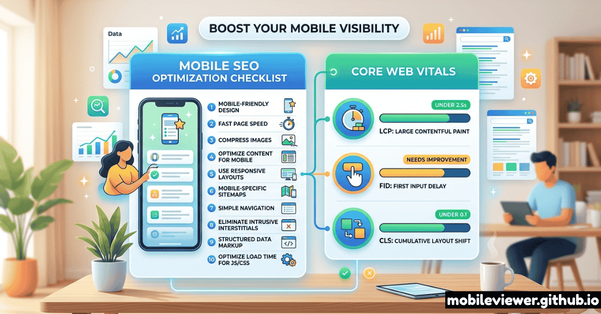
Core Web Vitals: The Non-Negotiables
Core Web Vitals are Google's official set of user experience metrics that directly influence search rankings. They're measured on real mobile users, not in lab conditions. Getting them into the "Good" range on mobile is the single highest-leverage SEO improvement most sites can make.
CWV scores are measured from the Chrome User Experience Report (CrUX) using real user data from the past 28 days. Your PageSpeed Insights lab score is useful for diagnosis, but Google's ranking signal uses field data from actual visitors on mobile connections.
The 15-Point Mobile SEO Checklist
Viewport Meta Tag is Correct
Every mobile page must have <meta name="viewport" content="width=device-width, initial-scale=1.0"> in the <head>. Missing this causes the browser to render your page at 980px and shrink it — Google's mobile crawler sees broken layout and tiny unreadable text. Also critical: never set user-scalable=no or maximum-scale=1 — it blocks accessibility zooming and is flagged in mobile usability reports.
Mobile and Desktop Content Must Match
Under mobile-first indexing, Google indexes the content it sees on mobile. If your responsive design hides sections behind display: none on mobile that are visible on desktop — including headings, body copy, and alt text — that content is not indexed. Audit your mobile CSS to ensure no content important for rankings is conditionally hidden on small screens.
LCP Under 2.5 Seconds on Mobile
The Largest Contentful Paint is almost always an image or a large heading block. On mobile over 4G, this is dramatically harder to achieve than on fiber desktop. Key fixes: preload your LCP image with <link rel="preload">, use next-gen formats (WebP or AVIF), serve correctly sized images with srcset and sizes attributes, and ensure your LCP element is not lazy-loaded. Check your field data in Google Search Console under Core Web Vitals.
INP Under 200ms (Interaction to Next Paint)
INP replaced FID as a Core Web Vital in March 2024 and is significantly harder to pass. INP measures the delay between any user interaction (tap, click, keyboard input) and the next visual update. Common causes of poor INP on mobile: long JavaScript tasks blocking the main thread, heavy event listeners, and synchronous XHR calls. Fix by breaking up long tasks with scheduler.yield(), deferring non-critical scripts, and auditing third-party tag payloads.
CLS Under 0.1 (No Layout Shifts)
Layout shifts on mobile feel jarring and hurt both UX and rankings. The most common causes: images without explicit width and height attributes, ads injected into content, web fonts causing text reflow, and dynamically injected banners above existing content. Always specify image dimensions, use font-display: swap with size-adjusted fallback fonts, and reserve space for ads using min-height.
Tap Targets Are at Least 44×44px with Adequate Spacing
Google's Mobile Usability report in Search Console explicitly flags "Clickable elements too close together." Tap targets smaller than 44×44 CSS pixels are nearly impossible to accurately tap on phones held at arm's length. Check every link, button, and form element. The most common offenders: inline text links, social share icons, and navigation items in hamburger menus. Add min-height: 44px; min-width: 44px to all interactive elements and ensure at least 8px of space between adjacent targets.
Text Is Readable Without Zooming (Min 16px Body)
Google's mobile usability check flags "Text too small to read" for body text under 12px, but the practical threshold for comfortable reading without zooming is 16px. Check your computed font sizes in DevTools mobile mode. Beyond size, also verify: sufficient contrast ratio (at least 4.5:1 for body text), line height of at least 1.5 for paragraphs, and adequate padding around text blocks to prevent content touching screen edges.
No Horizontal Scrolling at Any Mobile Viewport
Horizontal scroll on mobile is an immediate trust-killer and a confirmed usability signal Google checks. Test your page by dragging DevTools viewport from 360px to 430px — any horizontal overflow indicates a problem. Common causes: fixed-width elements wider than the viewport, unresponsive tables, pre-formatted code blocks without overflow handling, and CSS with width: 100vw not accounting for scrollbar width. Quick diagnostic: add * { outline: 1px solid red; } and look for elements spilling outside the viewport.
Structured Data Is Identical on Mobile and Desktop
If your desktop pages have rich schema markup (Article, Product, FAQ, HowTo, Review, etc.) but your mobile pages serve lighter markup, Google sees stripped schema under mobile-first indexing. This means you lose rich results eligibility — featured snippets, star ratings, FAQ dropdowns, and recipe cards — entirely because of a viewport-conditional script load. Audit your mobile HTML source, not just the rendered DOM, to verify all JSON-LD blocks are present.
Mobile Page Speed: Time to First Byte Under 600ms
TTFB is the server response time before any bytes reach the browser. On mobile networks with higher latency, a slow TTFB compounds all downstream loading delays. Targets: under 200ms is good, under 600ms is acceptable, over 600ms needs urgent attention. Key fixes: use a CDN with edge nodes close to your users, enable HTTP/2 or HTTP/3, review server-side rendering caching strategies, and eliminate unnecessary redirects (especially HTTP → HTTPS redirect chains).
Images Use Next-Gen Formats and Responsive srcset
Serving a 1400px JPEG to a 390px phone viewport wastes bandwidth and slows LCP. Use the srcset and sizes attributes to serve appropriately sized images. Combine with WebP or AVIF format for 25–50% smaller file sizes at equivalent quality. Check: every <img> above the fold should have srcset, every <img> below the fold should have loading="lazy", and background images should use media queries to serve scaled versions on mobile.
Canonical Tags Match Between Mobile and Desktop
If you run a separate m-dot mobile site (m.example.com) rather than a responsive design, your canonical setup must be flawless. Desktop pages should canonical to themselves; mobile pages must canonical to the corresponding desktop URL. A missing or incorrect canonical on the m-dot version causes indexing confusion and potential duplicate content signals. If you're on a responsive design, this item passes automatically.
Intrusive Interstitials Don't Appear on Mobile Entry
Google's mobile interstitial penalty targets pop-ups and overlays that cover the main content immediately after a user arrives from a search result. Specifically penalized: full-screen popups that require dismissal before content is visible, large banner-style overlays that push content below the fold, and standalone interstitial pages that appear before the page loads. Exceptions: legally required cookie consent, age verification gates, and small banners that use a reasonable amount of screen space.
Mobile-Specific Meta Tags Are Configured
Several meta tags affect mobile experience specifically: theme-color sets the browser chrome color on Android Chrome and Safari (improves PWA feel), apple-mobile-web-app-capable and apple-touch-icon affect iOS homescreen behavior, and format-detection prevents iOS from auto-linking phone numbers in content where you don't want them. While these don't directly drive rankings, they affect user experience signals and return visits.
Internal Links and Navigation Work on Touch
Navigation elements that rely on :hover pseudo-states are inaccessible on touch devices. Dropdown menus, mega menus, and tooltip-style link previews must have touch equivalents. Test every navigation element on a real device or with touch simulation enabled. Also check: breadcrumbs render correctly on small viewports, pagination is accessible and legible, and anchor links account for the fixed header height offset using scroll-padding-top.
Tools to Run This Audit
| Tool | What It Checks | Cost | Mobile Specific |
|---|---|---|---|
| Google Search Console | Mobile Usability report, Core Web Vitals field data, coverage | Free | Yes |
| PageSpeed Insights | CWV lab + field data, LCP element, improvement suggestions | Free | Yes |
| Mobile Viewer | Visual layout at exact device viewports, tap target visibility | Free | Yes |
| Screaming Frog | Canonical tags, meta tags, structured data, redirect chains | Free up to 500 URLs | Partial |
| Google Rich Results Test | Schema markup validity and rich result eligibility | Free | Partial |
| Lighthouse CLI | Full audit including accessibility, SEO, performance, PWA | Free | Yes |
Recommended Audit Process
Running all 15 checks in one session is overwhelming. Use this phased approach instead:
- Week 1 — Critical items (1–5): Fix viewport meta, content parity, and Core Web Vitals. These have the highest ranking impact. Use PageSpeed Insights and Search Console.
- Week 2 — High priority items (6–10): Fix tap targets, text size, horizontal scroll, structured data parity, and TTFB. Use Mobile Viewer to visually verify fixes.
- Week 3 — Medium priority items (11–15): Optimize images, canonicals, interstitials, mobile meta tags, and navigation. Use Screaming Frog for bulk checks.
- Ongoing — Monthly CWV review: Check your CrUX field data in Search Console monthly. A new third-party script, a new hero image, or a page template change can shift your scores.
Don't focus exclusively on your homepage. Google measures Core Web Vitals and mobile usability at the URL level. Your most important landing pages (category pages, product pages, high-traffic blog posts) each need to pass independently.