Your site renders identically on the iPhone 15 and Galaxy S23. Or so you think. In reality, these two devices — the dominant flagships on iOS and Android — differ in viewport width, device pixel ratio, safe area insets, scroll behavior, font rendering, and the underlying browser engine handling your CSS. Understanding these differences is what separates sites that look great on both platforms from sites that just "mostly work."
This reference covers every viewport-related dimension and browser quirk you need to know, with CSS code you can use immediately.
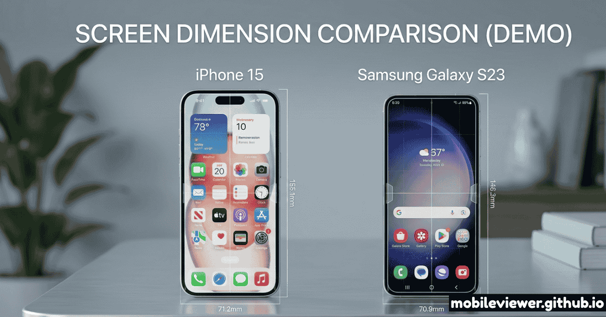
Core Viewport Specifications Side by Side
Let's start with the raw numbers. These are measured values in CSS pixels — what your media queries, vw/vh units, and JavaScript's window.innerWidth actually see.
iPhone 15
Galaxy S23
The iPhone 15's CSS viewport is 30px wider than the Galaxy S23's (390px vs 360px). This 8% width difference is significant enough to cause layout differences at your mobile breakpoints if you've only tested at one device width.
Full iPhone 15 and Galaxy S23 Lineup Matrix
The flagship is just one device in each lineup. Here's the complete current lineup for both families so you can target the right widths for your breakpoints:
| Device | CSS Width | CSS Height | DPR | Engine |
|---|---|---|---|---|
| iPhone SE (3rd gen) | 375px | 667px | 2× | WebKit |
| iPhone 15 | 390px | 844px | 3× | WebKit |
| iPhone 15 Plus | 430px | 932px | 3× | WebKit |
| iPhone 15 Pro | 393px | 852px | 3× | WebKit |
| iPhone 15 Pro Max | 430px | 932px | 3× | WebKit |
| Galaxy S23 | 360px | 780px | 3× | Blink |
| Galaxy S23+ | 360px | 772px | 3× | Blink |
| Galaxy S23 Ultra | 384px | 824px | 3.75× | Blink |
| Galaxy S23 FE | 360px | 780px | 3× | Blink |
| Google Pixel 8 | 384px | 832px | 2.625× | Blink |
| Google Pixel 8 Pro | 448px | 998px | 2.625× | Blink |
Android's DPR values are often non-integer (2.625×, 3.5×, etc.) and can vary by user font scale setting. On Android, users can increase system font size which changes the effective density. Always test with system font set to default and at the largest size.
Safe Area Insets: Dynamic Island vs Punch-Hole
Safe area insets are the CSS environment variables that tell your layout to avoid placing content under hardware cutouts and navigation bars. This is one of the most practically important differences between iOS and Android development.
iOS Safe Areas (Dynamic Island)
The iPhone 15's Dynamic Island sits at the top center of the screen and pushes the status bar content to the sides. The relevant safe area values in CSS:
padding-top: env(safe-area-inset-top); /* ~59px in portrait */
padding-bottom: env(safe-area-inset-bottom); /* ~34px (home bar) */
padding-left: env(safe-area-inset-left); /* 0px portrait, ~59px landscape */
padding-right: env(safe-area-inset-right); /* 0px portrait, ~59px landscape */
/* Full-screen fixed elements need viewport-fit=cover */
<meta name="viewport" content="width=device-width, initial-scale=1.0, viewport-fit=cover">
Android Safe Areas (Punch-Hole Camera)
The Galaxy S23's punch-hole camera is centered at the top. Android Chrome exposes safe area insets via the same CSS environment variables, but the values differ significantly:
padding-top: env(safe-area-inset-top); /* ~24px (status bar only) */
padding-bottom: env(safe-area-inset-bottom); /* ~16–24px (gesture nav) */
padding-left: env(safe-area-inset-left); /* 0px with gesture nav */
padding-right: env(safe-area-inset-right); /* 0px with gesture nav */
/* Note: Android values change based on navigation mode! */
/* Gesture nav: inset-bottom ~16px */
/* 3-button nav: inset-bottom = 0 (nav bar is separate) */
On Android, the bottom safe area inset value depends on which navigation mode the user has selected (gesture navigation vs. 3-button navigation). You cannot rely on a fixed value. Always use env(safe-area-inset-bottom) dynamically and never hardcode a pixel value.
Browser Engine Differences: WebKit vs Blink
This is the single most consequential difference between the two devices. Every browser on iOS — Chrome, Firefox, Edge, DuckDuckGo — uses WebKit, Apple's engine. The Galaxy S23 runs Chrome with Google's Blink engine. These engines handle CSS differently in ways that cause real visual differences.
Viewport Units: dvh, svh, lvh
The classic 100vh problem — where the mobile browser's collapsible URL bar changes the actual visible height — was a major pain point for years. CSS now provides three new dynamic viewport units to solve it precisely:
height: 100dvh; /* Supported: iOS 15.4+, Android Chrome 108+ ✓ */
/* svh = small viewport height (with browser chrome fully shown) */
height: 100svh; /* Safe for 'above fold' layouts */
/* lvh = large viewport height (with browser chrome hidden) */
height: 100lvh; /* Use for fullscreen/immersive experiences */
/* Fallback for older browsers */
height: 100vh;
height: 100dvh; /* Overrides if supported */
Scroll Behavior and Momentum Scrolling
iOS Safari applies momentum scrolling (rubber-band bounce) that Blink does not. If you have a custom scrollable container using overflow-y: scroll, you may notice it feels "sticky" on iPhone. The fix:
.scroll-container {
overflow-y: scroll;
-webkit-overflow-scrolling: touch; /* Legacy iOS, still useful */
overscroll-behavior: contain; /* Prevents parent scroll chain */
}
Input and Form Styling Quirks
iOS Safari aggressively applies its own styling to form inputs and buttons, often overriding your custom CSS. The Galaxy S23's Chrome is much more compliant with your styles:
input, button, select, textarea {
-webkit-appearance: none;
appearance: none;
border-radius: 0; /* iOS adds border-radius to inputs by default */
}
/* Prevent iOS from zooming in when an input is focused */
input, select, textarea {
font-size: 16px; /* Never go below 16px or iOS will zoom */
}
Media Query Strategy for Both Devices
Given the 30px width difference (360px vs 390px), a single mobile breakpoint at 768px catches both. But if you need to target each device family specifically:
@media (max-width: 380px) {
/* Styles for 360px viewport width */
}
/* Target iPhone 15 and most modern iPhones */
@media (min-width: 381px) and (max-width: 430px) {
/* Styles for 390px–430px viewport width */
}
/* Target iOS specifically using WebKit-only property */
@supports (-webkit-touch-callout: none) {
/* iOS-only CSS goes here */
}
/* High-DPI (Retina) screens — both devices qualify at 3× DPR */
@media (-webkit-min-device-pixel-ratio: 2), (min-resolution: 192dpi) {
/* 2× or higher: use @2x images, SVG preferred */
}
Image Strategy for 3× DPR Screens
Both devices use 3× device pixel ratios — meaning every CSS pixel is rendered with 9 physical pixels (3×3). A 100×100px CSS image needs to be 300×300px in physical resolution to look sharp. Here's the correct approach:
<img
src="hero-390w.jpg"
srcset="
hero-360w.jpg 360w, /* Galaxy S23 */
hero-390w.jpg 390w, /* iPhone 15 */
hero-780w.jpg 780w, /* 2× renders */
hero-1170w.jpg 1170w /* 3× renders (Retina) */
"
sizes="(max-width: 430px) 100vw, 800px"
alt="Hero image"
width="390"
height="260" /* Always specify for CLS prevention */
>
Landscape Mode: Where Things Break
In landscape orientation, the viewports flip: the iPhone 15 becomes 844×390px and the Galaxy S23 becomes 780×360px. On iOS, the safe area insets in landscape become significant — up to 59px on the sides to clear the Dynamic Island area. On Android, landscape is generally simpler.
Key landscape testing points:
- Modal dialogs and full-height overlays: in landscape,
100vhis very short (360–390px). Content that fits in portrait will be clipped. Useoverflow-y: autoon modals and test in landscape explicitly. - Video players with fixed aspect ratios: a 16:9 video in landscape at 780px width would be 438px tall — taller than the 360px viewport height on S23. Use
max-heightconstraints. - Forms: landscape keyboards leave approximately 200px of visible viewport. If your submit button is at the bottom of a form, it may be entirely obscured.
Testing Both Devices Without Owning Them
You don't need to own an iPhone 15 and a Galaxy S23 to test at their exact viewports. Several approaches give you accurate results:
- Mobile Viewer — select the iPhone 15 preset (390px, simulated WebKit) or Galaxy S23 preset (360px) and see your site instantly at the correct viewport dimensions
- Chrome DevTools — both devices are in the default device list. Switch between them and watch your layout reflow at the exact CSS widths
- Safari + Xcode Simulator — for testing actual WebKit rendering, run an iPhone 15 simulator via Xcode. This is the only tool that truly replicates iOS CSS behavior on macOS without hardware
- QR Code handoff — generate a QR code from Mobile Viewer and scan on a borrowed or available iPhone or Android for a real-device sanity check
Quick Reference Cheatsheet
| Property | iPhone 15 | Galaxy S23 | Developer Action |
|---|---|---|---|
| CSS Viewport Width | 390px | 360px | Test at both 360 and 390 |
| Device Pixel Ratio | 3× | 3× | Serve 3× images for both |
| Browser Engine | WebKit | Blink | Test on both; use @supports |
| Safe Area Top | ~59px | ~24px | Use env(safe-area-inset-top) |
| Safe Area Bottom | ~34px | ~16–24px | Use env(safe-area-inset-bottom) |
| Input Zoom on Focus | Yes (<16px) | No | Set font-size: 16px on inputs |
| Momentum Scroll | Yes (native) | No (Blink scroll) | Use -webkit-overflow-scrolling |
| dvh Support | iOS 15.4+ | Chrome 108+ | Use dvh with vh fallback |
| Default Input Styling | Heavy (WebKit) | Minimal | Use -webkit-appearance: none |