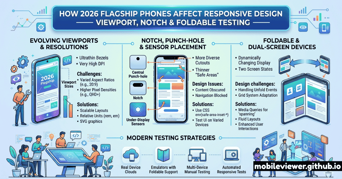
Every year, flagship phones ship with updated dimensions, changed notch configurations, and new form factors that quietly break layouts developers haven't revisited in years. In 2026, the changes are more significant than usual: the iPhone 17 lineup introduces a new camera bump design affecting landscape layouts, Samsung's Galaxy S26 Ultra extends to an even taller aspect ratio, and several devices ship with wider physical screens but the same logical CSS viewport — a mismatch that confuses developers accustomed to assuming a 1:1 relationship between physical size and CSS pixels.
This guide covers what actually changed in 2026 flagships, how it affects your responsive CSS, and what to test.
2026 Flagship Viewport Dimensions Reference
The key thing to remember: your CSS media queries see logical CSS pixels, not physical pixels. A 1440×3200 physical resolution Galaxy device has a device pixel ratio (DPR) of 3.5 and a logical viewport of about 412×914px. Here are the key dimensions for 2026 flagships:
| Device | CSS Viewport (portrait) | DPR | Aspect Ratio | Cutout Type |
|---|---|---|---|---|
| iPhone 17 | 393 × 852px | 3× | 19.5:9 | Dynamic Island |
| iPhone 17 Plus | 430 × 932px | 3× | 19.5:9 | Dynamic Island |
| iPhone 17 Pro | 393 × 852px | 3× | 19.5:9 | Dynamic Island (smaller) |
| iPhone 17 Pro Max | 440 × 956px | 3× | 19.5:9 | Dynamic Island (smaller) |
| Galaxy S26 | 360 × 780px | 3× | 19.5:9 | Punch-hole (centered) |
| Galaxy S26+ | 390 × 844px | 3× | 19.5:9 | Punch-hole (centered) |
| Galaxy S26 Ultra | 412 × 924px | 3.5× | 19.7:9 | Punch-hole (centered) |
| Pixel 10 | 393 × 851px | 2.625× | 20:9 | Punch-hole (centered) |
| Pixel 10 Pro XL | 412 × 914px | 3.5× | 20:9 | Punch-hole (centered) |
Notice that many 2026 flagships cluster around 390–412px wide in CSS pixels. Your breakpoints at 375px (old iPhone SE/standard), 390–393px (iPhone 17), and 412–430px (Plus/Pro Max/Ultra) need to be tested deliberately — the difference of 17–37px can cause unexpected word breaks, button overflows, and nav item truncation.
Dynamic Island in 2026: What Changed
The iPhone 17 Pro series ships with a smaller Dynamic Island than its predecessors. While this is primarily a hardware change, it has a CSS implication: env(safe-area-inset-top) is slightly reduced compared to iPhone 16 Pro. However, you should never hardcode safe area values — always use the env() variables and let iOS provide the correct value at runtime.
Use env(safe-area-inset-*) — Never Hardcode Pixel Values
The correct CSS pattern for Dynamic Island and notch avoidance: set viewport-fit=cover in your meta viewport tag, then apply padding-top: env(safe-area-inset-top) to any fixed or sticky header. For bottom navigation bars: padding-bottom: env(safe-area-inset-bottom). For landscape use env(safe-area-inset-left) and env(safe-area-inset-right). This works across all iPhone notch and Dynamic Island variants without hardcoded values that break on new hardware.
Test Landscape Orientation on All Flagships
In landscape mode on iPhone, the Dynamic Island (or notch on older models) sits on the left side, and safe area insets apply to the left and right edges — not top and bottom. Fixed sidebars, full-width banners, and horizontally scrolling carousels are the most commonly broken elements in landscape. Test landscape specifically on iPhone 17 Pro Max (now wider at 956px in portrait = 440px equivalent in landscape rotation) and note how the Dynamic Island changes your usable horizontal space.
Aspect Ratio Changes and Their Layout Impact
The trend toward taller aspect ratios continued in 2026. The Galaxy S26 Ultra at 19.7:9 and Pixel 10 at 20:9 mean that designs tested only at 16:9 ratios are significantly wrong on these devices — content that appears "above the fold" at 16:9 may require scrolling on taller phones, and layouts that look balanced at 16:9 can appear top-heavy at 20:9.
What to Check for Tall Aspect Ratios
- Hero sections: Full-viewport-height heroes (
height: 100vh) on a 20:9 screen are very tall. Test that your CTA remains visible without scrolling. - Fixed-height containers: Any container with a fixed pixel height (e.g., a card set to
height: 240px) may have too much empty space at the bottom on tall phones. - Scroll positions: Lazy-loaded sections that trigger on scroll may trigger differently on taller screens — test your scroll-based animations and lazy load points.
- Bottom navigation: Bottom nav bars need additional padding for home indicator safe area on iPhone, and may feel very far from the middle of the screen on a 20:9 phone held in one hand.
High-Refresh-Rate Displays and CSS Animations
All 2026 flagships ship with 120Hz or higher refresh rates (with ProMotion on Apple and adaptive refresh on Android). This is increasingly relevant for CSS:
- CSS animations at 60fps feel janky on 120Hz screens. Use
transformandopacityfor animations (GPU-composited) and avoid animatingwidth,height,top, orleftproperties which trigger layout recalculation. - Scroll-linked animations using the new Scroll Timeline API benefit significantly from high refresh — but poorly implemented scroll effects cause noticeable jitter. Test on a real 120Hz device.
- Transitions must feel snappy. The expected interaction response time on a 120Hz screen is under 8ms per frame. CSS transitions above 300ms duration feel sluggish to users accustomed to 120Hz.
Camera Bump and Physical Protrusions
The iPhone 17 series introduced a significant camera bump that affects how the phone rests on surfaces, potentially changing how users hold and interact with it in landscape mode. While CSS can't directly detect this, it's worth understanding for UX testing:
- Users holding an iPhone 17 in landscape will naturally avoid triggering tap targets in the upper-left corner (near the camera bump) — this is an ergonomics issue that shows up as poor tap accuracy in analytics.
- If you have landscape-specific UIs, consider shifting critical tap targets away from the camera-side corners.
Recommended Breakpoints and Testing Viewports for 2026
Based on the 2026 flagship landscape, here are the viewport widths every responsive design must test explicitly:
- 360px — Budget Android baseline (Galaxy S26, many entry-level devices). Your most space-constrained layout.
- 375px — Older iPhones (SE 3rd gen, iPhone 12/13 mini) still in wide use.
- 390–393px — iPhone 16/17 standard, Galaxy S26+. The most common iOS viewport in 2026.
- 412px — Pixel 10 Pro, Galaxy S26 Ultra. Common large-screen Android viewport.
- 430–440px — iPhone 17 Plus and Pro Max. Largest mainstream phone viewport.
- 768px — iPad mini, small tablets. The classic tablet breakpoint remains relevant.
- 1024px — iPad 11" and standard iPads in landscape / small laptop / tablet with keyboard.
Testing only at 375px and 414px misses a significant portion of 2026 flagship users. The 390–393px range (iPhone 16/17) is now the most common iOS viewport width, and 412px covers a large chunk of flagship Android. Layouts that look fine at 375px often overflow or misalign at 393px due to subpixel differences in grid columns, padding, and font scaling.
For a broader look at how foldable phones and wearables add additional viewport complexity beyond flat-screen flagships, see our companion guide on testing foldable phones and multi-screen devices. For the impact of these new viewports on your Core Web Vitals scores (especially LCP on large high-DPR screens), read our Mobile Core Web Vitals mastery guide.
The bottom line for 2026 responsive design: the shift isn't dramatic, but the details matter. Most sites won't break completely on new flagships — but layouts will subtly misalign, text will wrap differently, and tap targets that were marginal at 375px will become genuinely problematic at 393px. Systematic testing at the viewport widths above, using a combination of Mobile Viewer for fast visual checks and real devices for final validation, will catch these issues before your users do.